|
Describe: My piece is a pair of glasses with no lens that has black thread with beads tied around the lens. I also wrapped some colored thread around the arms of the glasses to add more color and to make it look less like glasses. There are also some bead on the bottom of the glasses.
Interpret: The overall mood and feeling of my wearable art piece is happy and silly. I made this piece to make people happy because of how silly it is. Analyse: I believe that my piece is visually balanced because there are the same amount of beads on each side of the glasses. But at the same time each bead is different and I don't think it is balanced. I do not believe that my glasses are cohesive because of all the random beads make it abstract. I think it goes together even though all the beads are different and don't really go together. Judge:
0 Comments
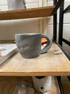
 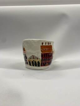 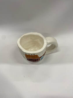 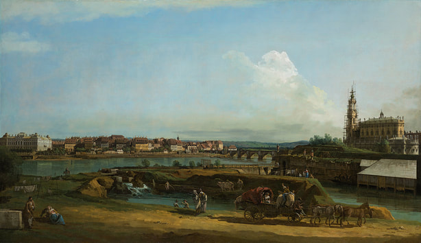 1. Some positives that I found in my piece were the use of coiling my mug, instead of throwing it on the wheel. The reason I found this positive is because I was able to make a bigger mug which would allow me to actually use it, unlike the mugs that I threw which were too small to drink out of. Another thing I found positive about my mug is the design. I think it matches perfectly to the inspiration piece that I found at the NCMA. I also found the colors that I added to be a success because they all went together and gave the same vibe of the inspiration piece even though they were not the exact same colors.
2. Some negatives I found on my piece were that mug and the handle may have been too big, but they are proportional to each other. Another thing that I found negative about my piece was that some of the colors bled together and it did not look as clean as I wanted it to. 3. My process started with me creating a flat base using the slab roller. Then from that flat piece I began to coil until I got my desired height. Once I reached the height I then flattened out the coils and all the bumps throughout my piece. Then I added the handle and let it get leather hard so I could carve into it. Although I could not get it completely smooth, I began carving the details of the buildings. I was planning on using an underglaze pencil to make the windows, but I did not like the way it looked so I ended up putting glaze over it. Then I went and carefully glazed all the buildings because I did not know what I was going to do for the background. I decided to just leave it white so I went over the background with white glaze. I ended up having to glaze it 3 times because some spots were super thin.  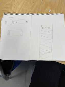 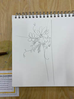 My table idea was a bouquet of flowers in the corner of a collab space. Each person could make a different flower any way they want. It would create a diverse bouquet to show the diversity of the world.
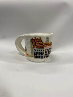
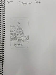 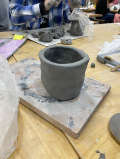 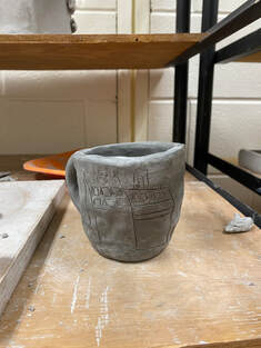  1. My piece is in the shape of a large mug and was made using coils. It is a thin mug but is not too thin. The handle is a pull handle and it is very thick. The handle is also very disproportionate to the mug, because it is so large. I then carved very thin designs of the square buildings onto the mug to create the scene in the painting. I am planning on doing the windows with a underglaze pencil in order to have more dimensions.
2. I began by coiling my mug into making a large mug. I put the coils on the outside of the mug in order to make it larger. Once I laid the coils on the mug I then smoothed it out. Then I added the extremely large handle on the mug. Finally I carved all the details of the building onto the mug. 3. My piece is inspired by the painting that I picked because I carved the same buildings into my mug. I believe that my piece was successful because the buildings look very similar to the ones on the painting. 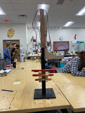 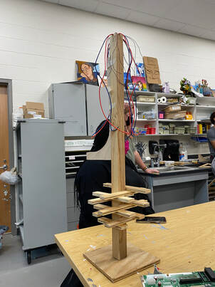 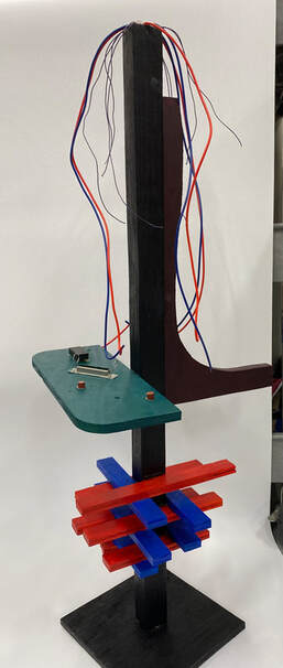 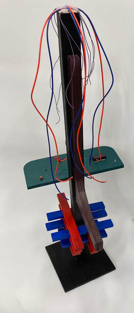 1. I utilized negative space by stacking the bottom pieces in a way that allows them to be together, but also has space in between them that shows the black on the base post. There is also negative space on the purple piece with its curvature. I utilized positive space with the wires on the top of my piece. The reason they are utilizing positive space is because they are active pieces that move easily.
2. I found it very difficult to come up with an idea and come up with what my piece is going to look like. I also found it difficult to utilize the pieces in a way that they don't look abstract. Non-objective sculpture is very difficult to come up with an idea. 3. I found the colors on my piece very successful. Even though they are all very different and would not usually go together, they look very cohesive. The green flat piece looks like a motherboard of a computer, but that was not intentional. 4. At first I started with the base and the pole. Then I glued all the the little pieces on the bottom, just gluing the pieces on the side of the base and the top of the one under it. Then I started to glue the wire onto the top of the piece in a way where it was all even. Then I added the purple piece to the side and finally I added the flat wood piece onto the side. I also added computer parts to flat piece to add some different materials. Then I began picking a color that goes with everything as the base, like black. Then I started adding colors at random and they ended up being cohesive. 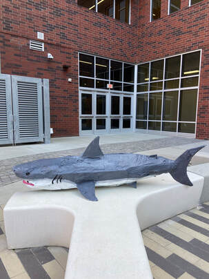 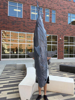 1. I found the structure and the whole body of the shark very successful. I think the body of it looks very realistic. The body is very strong and it is not going to be bending around. The reason I find this successful is because it is very proportional with all the fins and teeth.
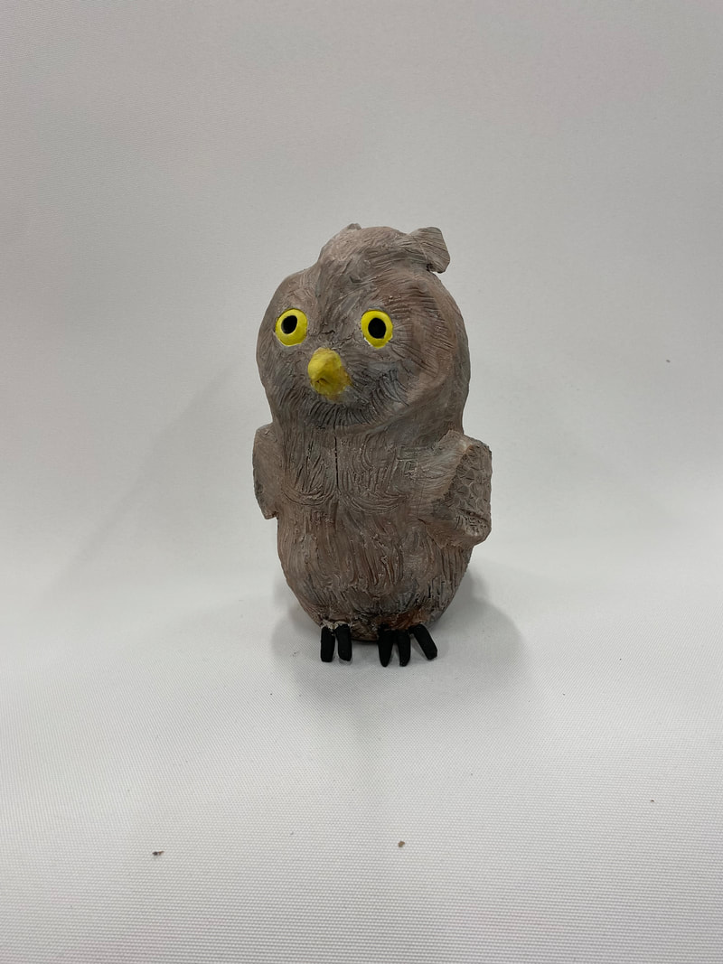
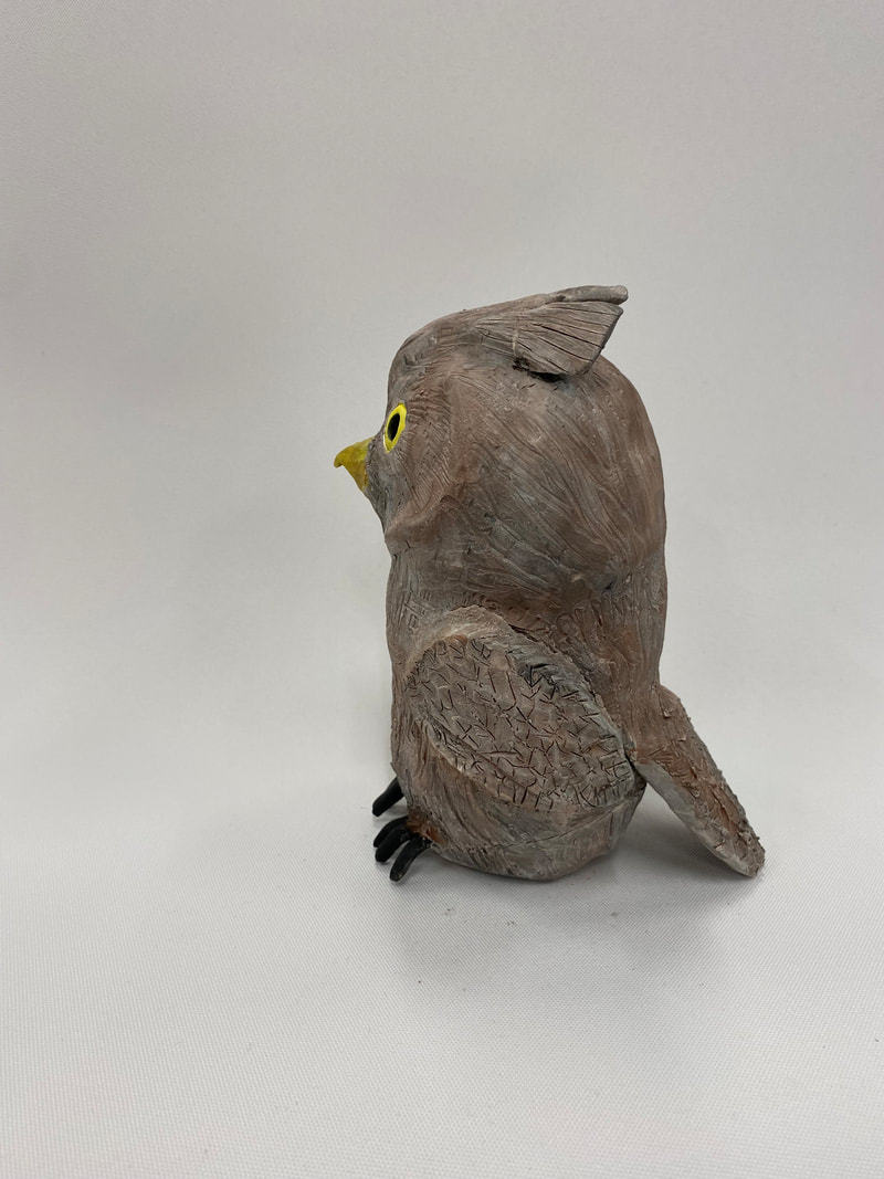
2. If I was able to redo this project I would make it smaller and paint it to be more realistic. The shark does have a dark gray back and a white belly but there are also many scars on the body that we did not add to the shark to make him unique. The size was too big and took a lot of work to complete. 3. The process my group took to complete our shark started with creating a base that we can add layers to, to get the exact size that we wanted. Next we added paper towels between the layers to make it stronger. Then we began to paper mache the first layer. Once we were finished the first layer we added on all the fins and started on the second layer. After we were done doing paper mache we added the cardboard teeth to the mouth. After all the teeth had been added we began painting the top half of hte shark dark gray and the bottom white. 1. I found that the water color on the bisqueware clay very successful. By using the water color it allowed my textured details to pop out. I was also able to mix the brown and black to get the right color mixture all around the owl.
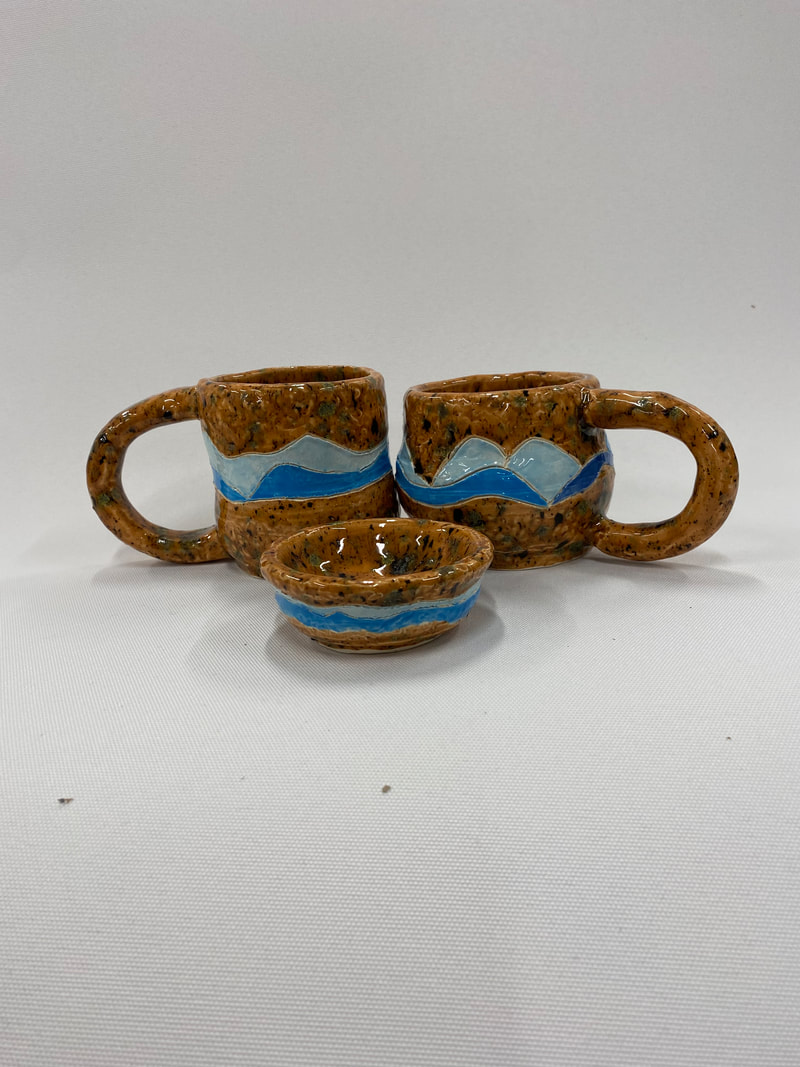
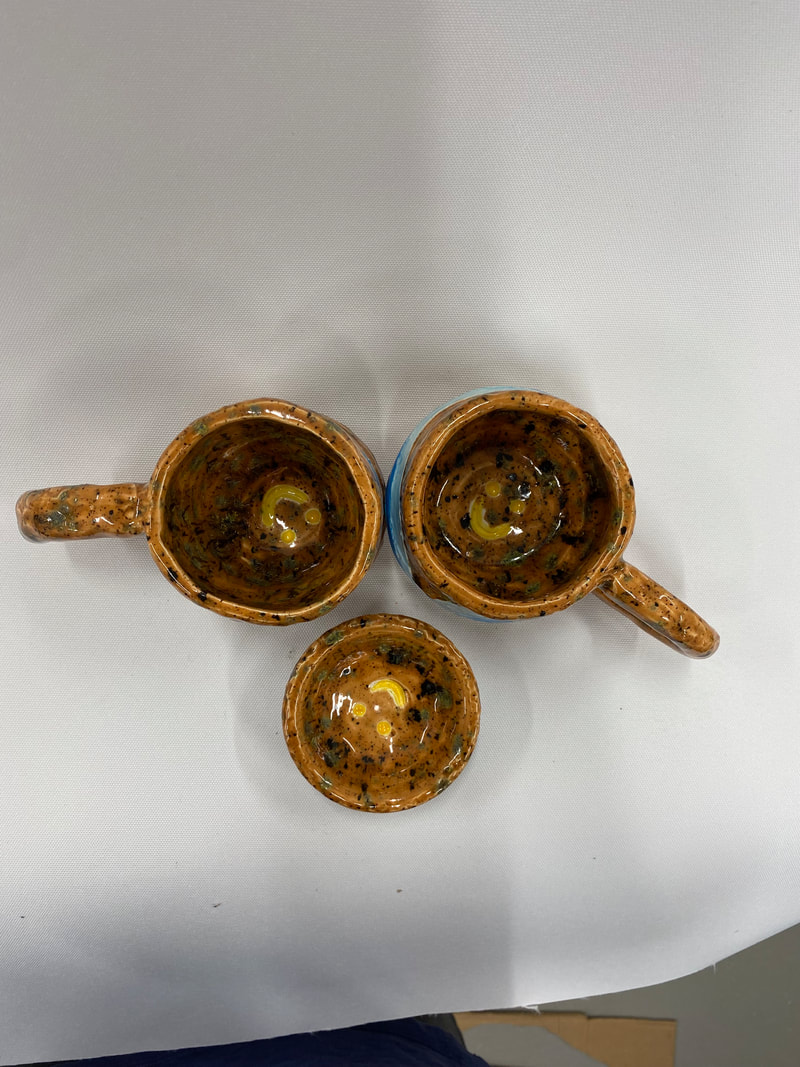
2. If I was to create this piece again I would try to make the owl look more realistic. I did not have very realistic feather details on the wings and around the body. There are also supposed to be feathers around the feet of the owl but I did not put them on. 3. My process for making my owl started off with 2 pinch pots that I coiled together to make a peanut looking shape. First I added the eyes and the beak. Then I began adding on details like the wings, the feathers on the top of its head, and the face coils. I added the coils on the face to add dimension to the structure of the owls face and to make it look more realistic. Next I added the tail and began carving out the feather texture. Finally I added the talons before I put it in the kiln. After the bisque fire I began to paint him with water color, in order to see all the details of the feather. 1. I found the glazing of my mugs and bowl very successful. Even though it is not what I expected the glaze to look like, I actually like it much more than how I thought it would turn out.
2. I would change the shape and size of my mugs, if I was able to do this project again. I found the size of my mug too small to hold the right amount of coffee or tea. The bowl's size was not suitable for putting anything in there other than rings or some kind of smaller jewelry. I wanted the mug to be more straight and taller, but I was unable to achieve that on the wheel. 3. My process involved first throwing the bowl, but I did not have enough clay so I just had to go with the size that I made. Next I threw my mugs and it took a couple of times to get a shape that I liked. Once I was done throwing I let my mugs harden before I added the textures from my stamp and the line for my mountains. I also stamped a smiley face at the bottom of my mugs and bowl. Then I put the handle on. I used the method of coiling to make my handles. After it was done bisque firing I added the glaze. I used different shades of blue for the mountains and I used a light brown with many glass pieces on the rest of the cup. 1. I picked the owl because I thought that wing texture would be fun to recreate. The head also has a lot of details that I thought would be interesting to do with clay.
2. First I made two long pinch pots, with one of them having a flat bottom. Then I began to coil the bottom piece until I thought it was the right height for an owl. Then I attached the top pinch pot to the coiled parts and it looked like a peanut. Then I made the eye sockets and added on the details that popped out of the owl. 3. I found making the feather details very difficult. They were much larger that I originally drew then so it was difficult to have to start over multiple times. I was able to overcome it by making the feathers not as detailed, instead I made them as carvings that looked crazy and more natural. 4. I found that the eyes and the facial features of my owl were very successful. The texture on the owl's face looked very realistic. I also found the size of my owl very proportional to all it's features. |